Content research to content design
CHALLENGE
Insurance is full of complex terms—how well do users think they understand them and how well do they actually understand them?
SOLUTION
A two-part study measuring both perceived and actual comprehension of auto insurance coverages.
HOW I HELPED
Designed and conducted multiple-choice and open-field surveys to assess understanding
Identified gaps between user confidence and actual comprehension
Translated findings into concrete recommendations for coverage definitions and in-app content strategy
Team: Allstate
Start by understanding how users understand
If you're in UX, you're in research—whether your title says so or not. I use research to surface what users really need and how content can meet them there. The tools change, but the goal stays the same: clarity that builds trust.
That’s why I don’t limit my research to copy testing. My toolkit includes:
Heuristic reviews (What’s broken?)
Literature reviews (What’s already known?)
Surveys (What do users say?)
Tree tests and card sorts (How do users find and group information?)
Comprehension assessments (Can users explain what something actually means?)
Below is a project where I looked beyond the content itself to understand the thinking behind it. By studying users’ confidence vs. comprehension of insurance terms, we uncovered critical gaps between what people think they know and what they actually understand.
In this case study, I designed and conducted a comprehension study to better understand how users interpret common insurance coverages—and how confident they are in that understanding.
Case study: coverages comprehension
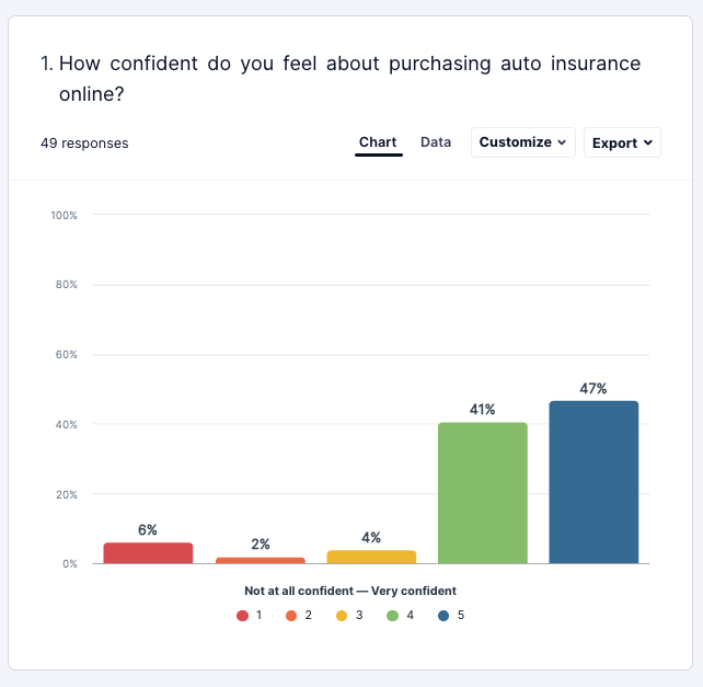
What does the user need to know, and what’s getting in their way? To answer that question in one project, I ran a test to gauge how well users understood common auto coverages—the backbone of their insurance policy.
I asked one set of users to explain coverages in their own words, then used multiple choice to ask a separate group of users to choose the correct coverages definitions.
What I found
Confidence doesn’t equal correctness
People think they understand terms like "comprehensive" and "bodily injury liability." They don’t. Some of the most incorrect responses came from users who were most confident. This suggests many users aren't just uninformed—they're misinformed.
Comprehension soared when definitions were provided
When users had access to even short definitions, accuracy improved by ~35%. For uninsured/underinsured motorist coverage, the correct response rate jumped 31.2%.
One of the most common coverages caused the most confusion
”Comprehensive coverage” was consistently misunderstood, even with definitions. Many assumed it meant “everything” was covered. This highlighted a dangerous misconception that would inevitably lead to disappointment and frustration.
“It covers everything—collision, personal injury, rental, etc.” -Confused User
What I recommended
My final recommendations focused on meeting users where they are—not where we assume they are, or even where they think they are.
Embed clear definitions at the point of decision
We should never make users check or choose coverage without first ensuring they understand it.Design for the confidently wrong
Most tools assume a lack of knowledge. This study showed we need to address false confidence just as much.Use this framework to test home insurance next
The problem isn’t limited to auto—and the solution shouldn’t be either.
Impact
This work reframed internal conversations about comprehension and content accessibility. It became a catalyst for:
Reworking how coverage info is displayed in our mobile experience
Re-evaluating legal and content team collaboration on high-stakes terms
Positioning reading level—and subject matter familiarity—as key accessibility concerns in UX
Take a look at how this work continues to shape my work.
Design impact: a new coverages screen
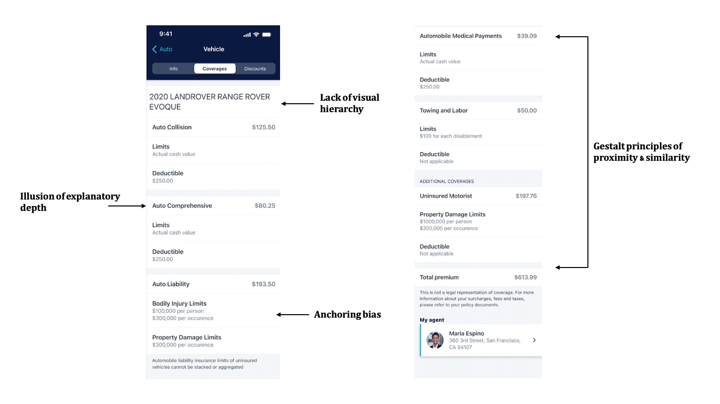
The findings weren’t just interesting—they were actionable. The existing coverages screen in the Allstate app offered no definitions, no clarity, and no path to understanding. It felt like a spreadsheet, and it assumed users already knew what each coverage meant. Our research proved otherwise.
The problems with the coverages experience
Gestalt principles of proximity & similarity: When coverage types aren’t visually grouped or differentiated, users can’t easily see which coverages go together or serve similar purposes, making the information harder to digest.
Illusion of explanatory depth: Without explanatory support, users fall victim to the illusion of understanding—confidently making decisions based on misunderstood information.
Lack of visual hierarchy: When all text and numbers are presented with equal weight, users have no guidance on where to focus, which slows comprehension and erodes confidence.
Anchoring bias: When users see numerical values (like limits and deductibles) without context, they're likely to form biased judgments based on arbitrary anchors rather than informed understanding.
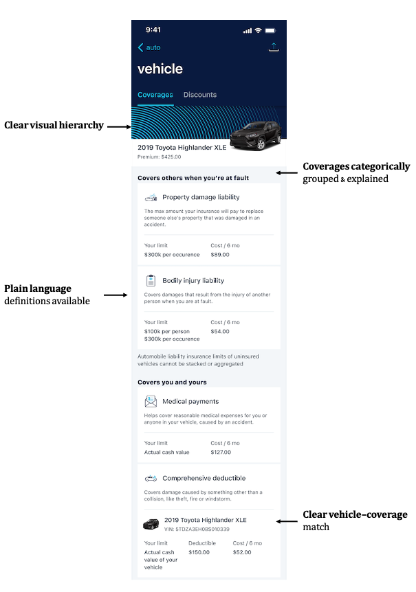
Based on these issues and my extensive content research, I proposed a content-forward redesign: one that brought plain-language definitions into the experience and made space for users to explore coverages. This concept is now being implemented by our product and development teams.
The new coverages screen
With the issues identified, many of the design solutions were salient:
I paired each coverage name with a short, plain-language definition to help users recognize gaps in their understanding and build a more accurate mental model of what each coverage actually means.
We introduced clear headings, subheadings, and typography treatments to guide users’ attention to the most important information first, reducing cognitive load.
I grouped related coverages categorically and used easily understood headings to signal which items belong together, making the page easier to scan and understand at a glance.
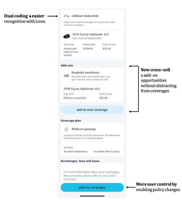
We paired icons with each coverage to support dual coding, speed up scanning, and reduce reliance on definitions alone.
There are opportunities to continue to learn and improve (e.g., I would love to improve our understanding of how users view numbers such as limits or deductibles), but this redesign—thanks to the research—has laid the foundation for future work.