
Crash detection
Allstate UX writing
CHALLENGE
Help people get help when they’ve had an accident.
SOLUTION
A big, simple experience with simple, clear language.
HOW I HELPED
Collaborated with UX designer to overhaul existing experience
Developed new copy for testing and participated in user research sessions
Edited existing copy for simplicity
Team: Allstate
Helping users in high-stress situations
Project overview
Crash detection connects users to help immediately after an accident, offering crucial assistance during a high-stress event. As part of the UX team, I helped redesign the beta version of the crash detection feature to prepare it for a nationwide rollout.
This redesign focused on creating an intuitive, user-centered experience that would simplify decision-making when users are most vulnerable.
The original crash detection screens were cluttered with legal content and complex instructions, making it difficult for users to navigate after an accident. We quickly realized the design failed to consider the way heightened stress in these moments limits cognitive and motor functions. The beta design also failed to account for users who hadn’t enabled the necessary permissions for crash detection to work.
The old design

Designing for fight-or-flight moments
Given that crash detection engages users in a fight-or-flight state, we incorporated research from cognitive science and user behavior in high-stress environments. I consulted with Katie Swindler, an expert in designing for high-stress situations, to ensure that our approach was grounded in science.
Key insights included:
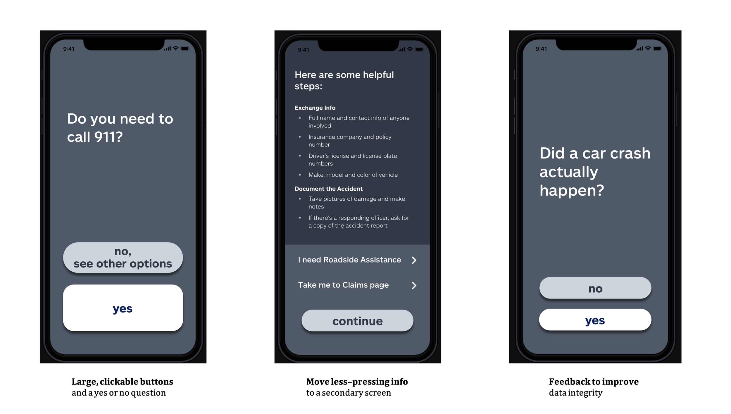
Fine motor skills decline under stress, making large, tappable buttons essential.
Cognitive load needs to be reduced, as users struggle with complex instructions or decisions during stress.
De-escalation is crucial to help users regain composure after receiving help.
This collaboration was instrumental in shaping our decisions for the final design.
Simplifying content and reducing cognitive load
As the UX writer on the team, I took charge of simplifying and clarifying the language across the crash detection flow. I worked closely with designers and product managers to create a user-friendly interface that guided users through the process with minimal stress. My contributions focused on:
Oversized, accessible buttons: Ensuring users with shaky hands could easily tap critical actions.
Clear, simplified language: Reducing jargon and focusing on short, digestible instructions that could be understood at a glance.
Streamlined decision-making: Reducing the number of decisions required at each step, minimizing cognitive load and making the experience intuitive.
Calming de-escalation messaging: Providing supportive and reassuring messaging to help reduce user anxiety once help was on the way.
Starting with low-fi prototypes
We began with low-fidelity, grayscale prototypes, which allowed us to focus on the overall flow and experience without being bogged down by visual details. My work on the UX writing side ensured that each step of the process was clear, actionable, and intuitive.
The final experience
Other projects might call for more elaborate content, but this one required minimalism.
The final design prioritized ease of use and clarity, reducing unnecessary content and structuring the crash detection flow around clear, easily understood choices. This also applied to the opt-in pages, where I eliminated legal jargon and helped users methodically set up crash detection.
The new design

