
Redesigning crash detection for high-stress users
Crash detection offers users help during some of their most stressful moments—after a car accident. I was part of the UX team tasked with redesigning the beta version of this feature to prepare it for nationwide rollout.
This redesign had to account for users in high-stress environments, requiring a thoughtful approach to every detail.
Identifying the problem
The original crash detection screens were dominated by legal jargon, failing to consider users' mental state after an accident. We recognized that users needed a clearer, simpler, and faster experience, especially when they are likely to be shaken or stressed.
-
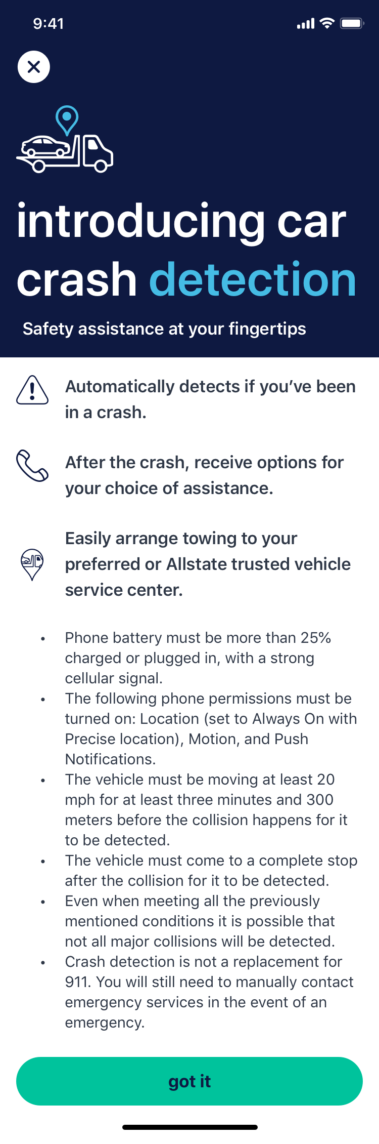
The intro to crash detection.
-
The first screen of crash detection matched every other screen in the app.
-
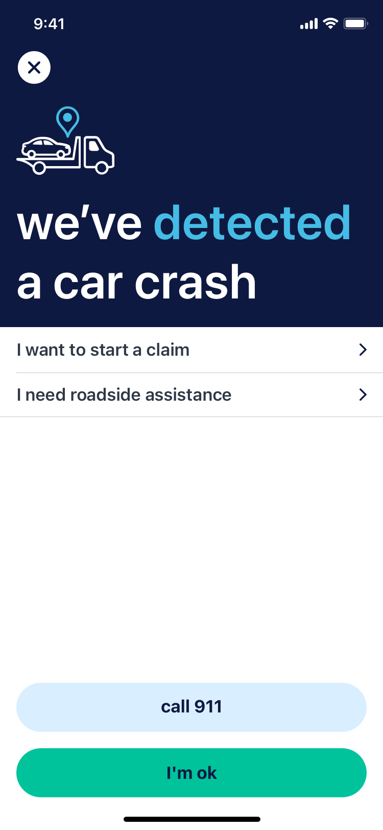
Starting a claim immediately after detecting a crash felt misplaced.
Low-fi redesigns
So much important UX work is done in the nitty gritty—starting with the ideal path, but then identifying all possible offshoots and how they can help or hinder the experience.
We tackled these details by building a grayscale prototype and dreaming up everything the experience could contain.
-
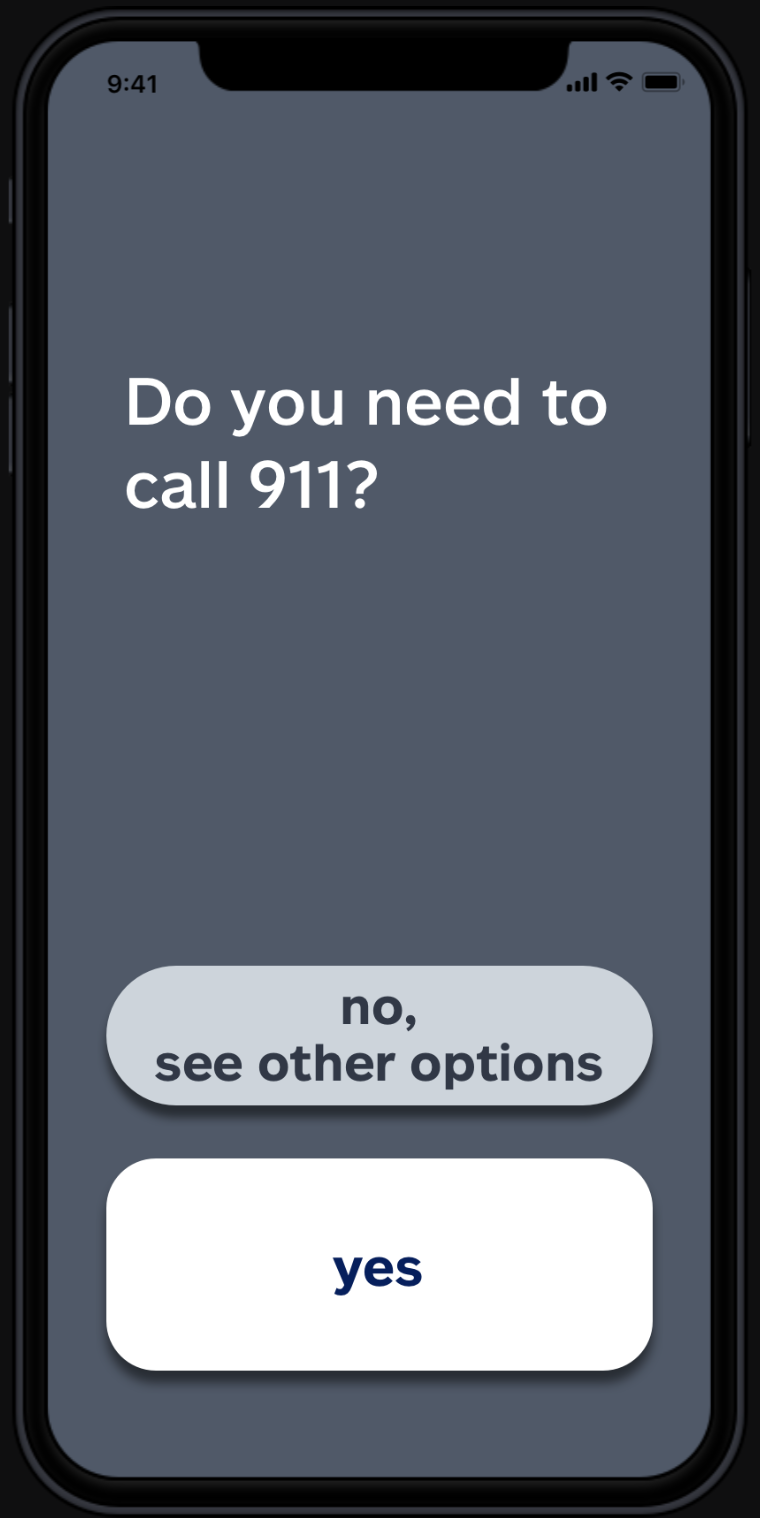
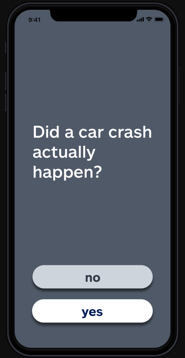
A simpler approach to the initial experience.
-
We toyed with the idea of a to-do list after an accident.
-
We wanted to introduce a feedback loop to improve data integrity.
Design challenges in high-stress scenarios
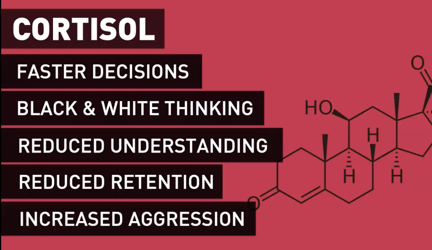
Stress dramatically changes how people process information: fine motor control declines, complex instructions become confusing, and decision-making shifts to immediate survival needs.
My focus was to reduce the cognitive load on users by simplifying content, minimizing actions required, and ensuring large, easy-to-use touch targets.
My role: streamlining the experience
I worked closely with our UX designers to overhaul the content and layout. Key improvements I led included:
Oversized, tappable buttons to accommodate shaky hands.
Simplified language, reducing legal and technical jargon to the essentials.
Fewer decision points, guiding users through the process with minimal confusion.
De-escalation-focused messaging, calming users once they were safe and had received help.
Given the unique challenge of designing for stressed-out users, I collaborated with Katie Swindler, whose research on life-and-death design provided insights on how stress affects decision-making. Her guidance helped refine the UX further, ensuring that the design worked with users' cognitive limitations, not against them.
“The best thing technology can do when someone is in fight-or-flight mode is to protect them from harm and get them back to a rational state of mind as quickly as possible.”
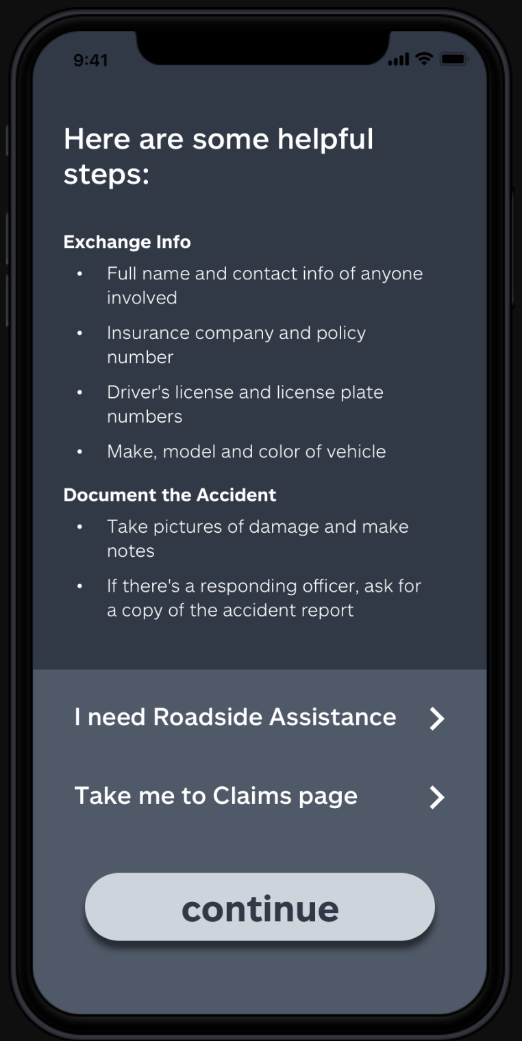
The final experience: simplified and user-centric
Our final design prioritized ease of use and mental clarity. We reduced unnecessary content, focused on what mattered most, and structured the crash detection flow around clear, easily understood choices.
This also extended to the opt-in pages for the feature, where I worked to make legal content digestible, helping users make informed decisions without overwhelming them.