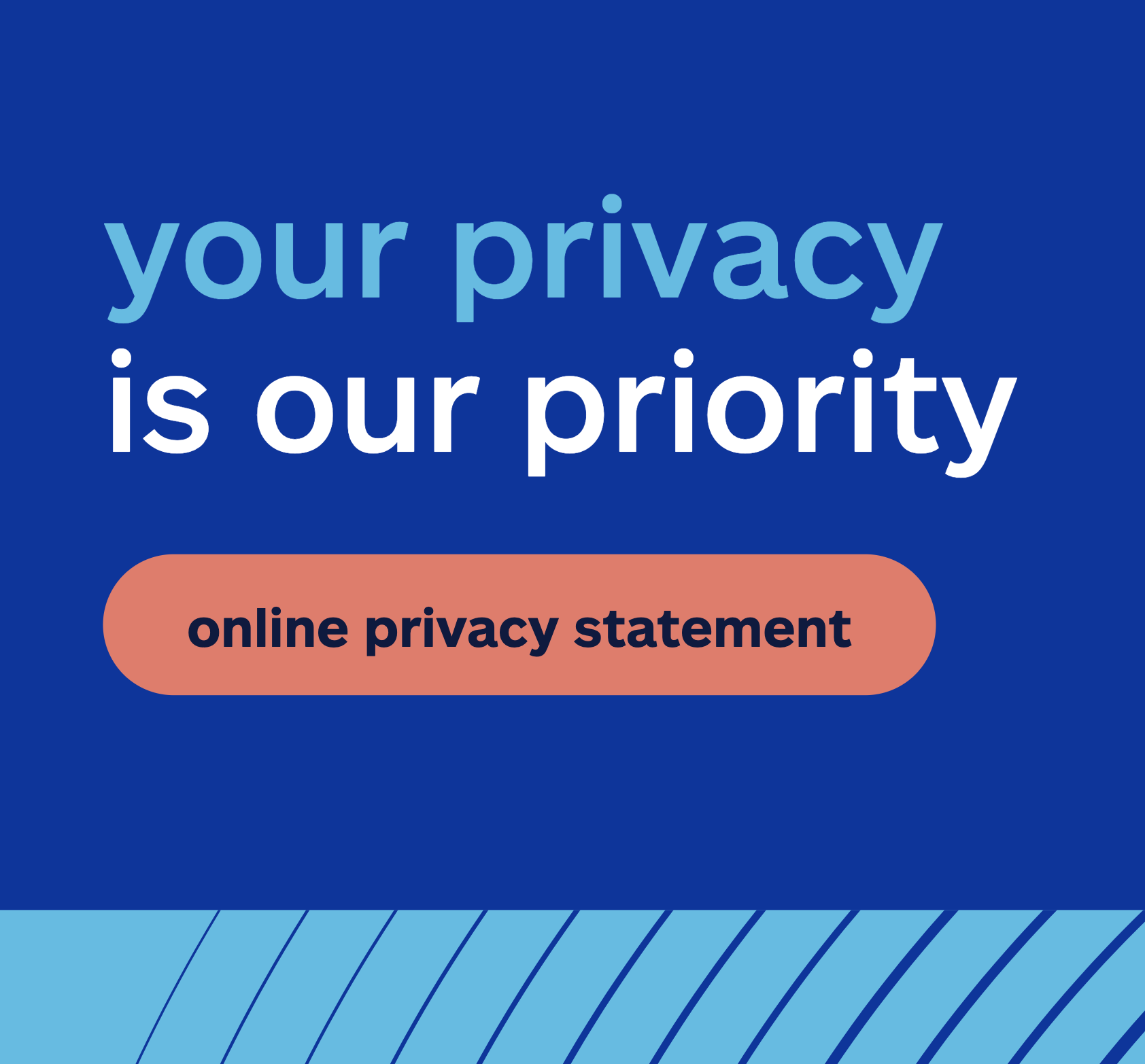
Privacy policy screen
Allstate UX writing
CHALLENGE
Make Allstate’s privacy policy more accessible by simplifying legal content without sacrificing compliance.
SOLUTION
A redesigned Privacy Center that prioritized clarity, reduced reading level, and empowered users to understand and control their data.
HOW I HELPED
Led research and content strategy to position reading level as an accessibility issue
Worked with legal, design, and research teams to simplify complex legal language while maintaining compliance
Crafted clear, digestible definitions to make privacy rights easier to understand
Team: Allstate
Accessibility begins with words
A UX writer’s responsibility isn’t just to inform—it’s to ensure that every user, regardless of background, can understand and act on the information provided. Language is a gatekeeper, and when it’s too complex, it excludes. That’s why reading level should always be approached as an accessibility issue, just like color contrast or screen reader compatibility.
At times in a company as large as Allstate, legal can become a major (although necessary) obstacle for usability. However, in my experience, the more you can position complexity in both content and design as an accessibility issue, the more receptive legal partners will be to making changes.
The Allstate privacy center
The Allstate Privacy Center page was built with one goal in mind: empowering customers by providing clear, actionable control over their own data. Unfortunately, because of its broad-reaching implications, this projected had been mired in legal pushback. The UX team seemed to be in a gridlock.
Content suggested by business and legal partners

Problems with legal requests
Lengthy content overwhelmed users, presenting them with too much information, increasing cognitive load and slowing comprehension.
Language was complex and jargon-heavy, reducing accessibility and failing to provide a plain-language explanation that prioritized clarity and user understanding.
The messaging missed the core goal of the page: building trust. It failed to reassure users about their privacy, security, and control.
Presenting the case: reading levels as an accessibility issue
I led the charge to simplify complex legal content without losing key compliance elements, an effort that was central to the project’s success.
Writing for a lower reading level was a top priority. Research shows that the average adult in the U.S. reads at a 7th- to 8th-grade level, with about half of Americans unable to understand content above the 8th-grade level. Privacy policies are often filled with legal jargon, and ensuring this content was accessible to a wider audience was a major hurdle.
To drive home the importance of this approach, I worked closely with our legal team. I made a case for “reading level as an accessibility issue,” highlighting that if the average customer can’t comprehend the language in their privacy policy, they won’t engage or trust the content. I demonstrated how lowering the reading level would still meet legal requirements while boosting user comprehension. This negotiation helped me refine the content to ensure that it worked for everyone, not just those with advanced reading skills.

I then utilized Hemingway Editor to visualize for legal partners the complexity of their content vs. my suggested content.


Simplifying legal jargon
Through iterative rounds of content design and legal feedback, we broke down dense legal statements into simple, digestible blocks of text. Every section was tested for both clarity and legal compliance.
We kept the language simple without watering down the important privacy protections. By ensuring the content was written at an 8th-grade reading level, the final product was more user-friendly and accessible.
