An example of my UX methodology — start to finish
All UXers have their areas of expertise—whether content, visual, research, or another—but user experience is more than the sum of its parts. Each contributor needs a critical mindset that sees each step through the eyes of the user.
Regardless of my role on the team, I always start with foundational principles of UX.
Back to the basics — leading a heuristic review
In a retro, I looked back at our sprint and forward to the next one and realized… the UX workload was filled with fulfillment projects from our product team. Nary an ambitious UX improvement in sight!
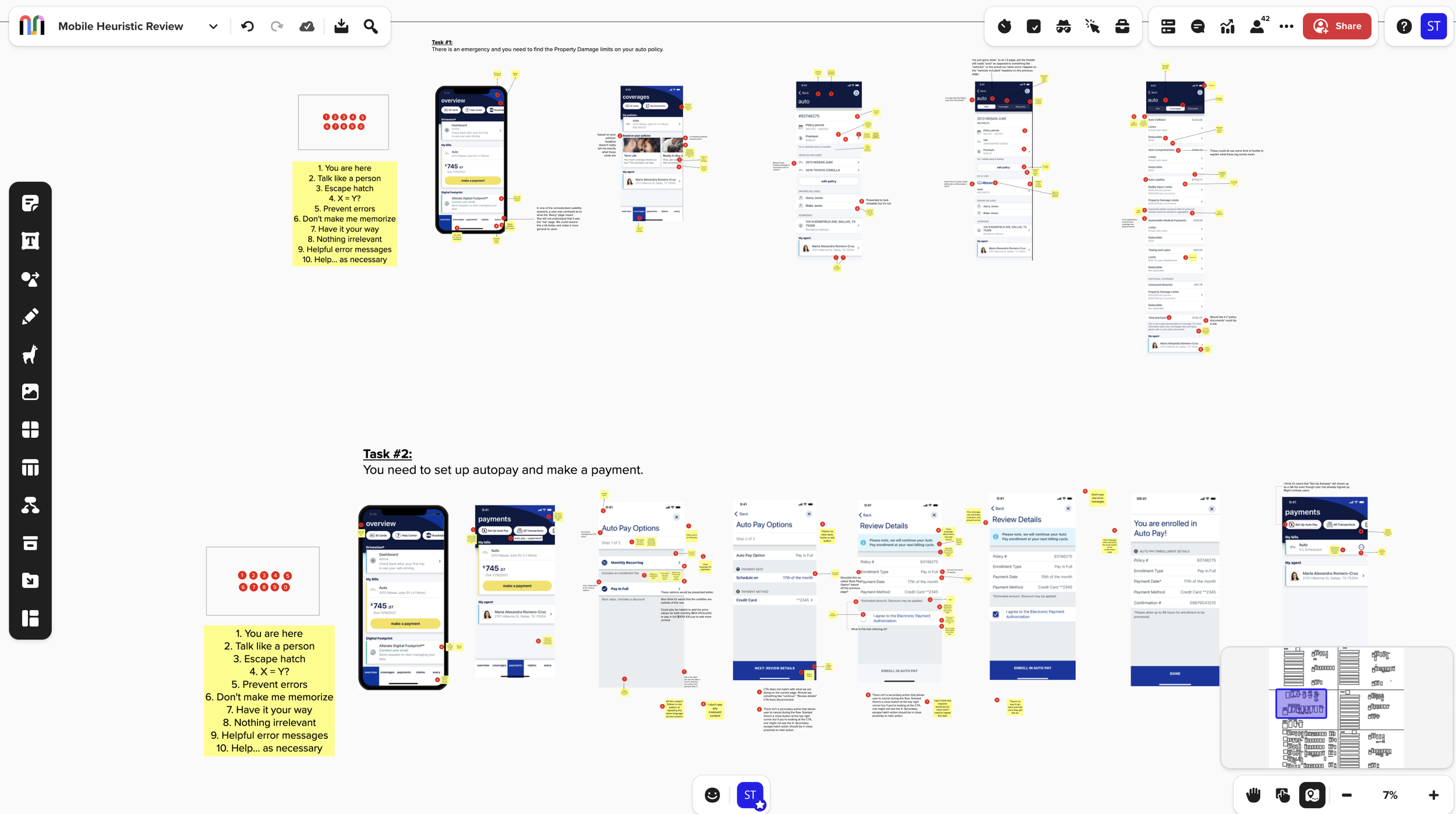
So, I set up a heuristic review of the mobile app with the entire UX team.
We’d fallen into a habit of delivering what projects were requested, so it was time reestablish our perspective on what the app could be.
New priorities and key findings
On top of lots of little things (inconsistent iconography, too much insurance jargon, etc.), getting around our app wasn’t as easy as it should be.
Our navigation broke heuristic rules 1, 4, 6, and 8 in different ways and to varying degrees.
Fortunately, just after the heuristic review, there was a meeting on the calendar where I’d have a chance to present recommended improvements for the app to Allstate execs.
I saw the perfect opportunity to get momentum behind our most pressing need—a new navigation for the Allstate app.
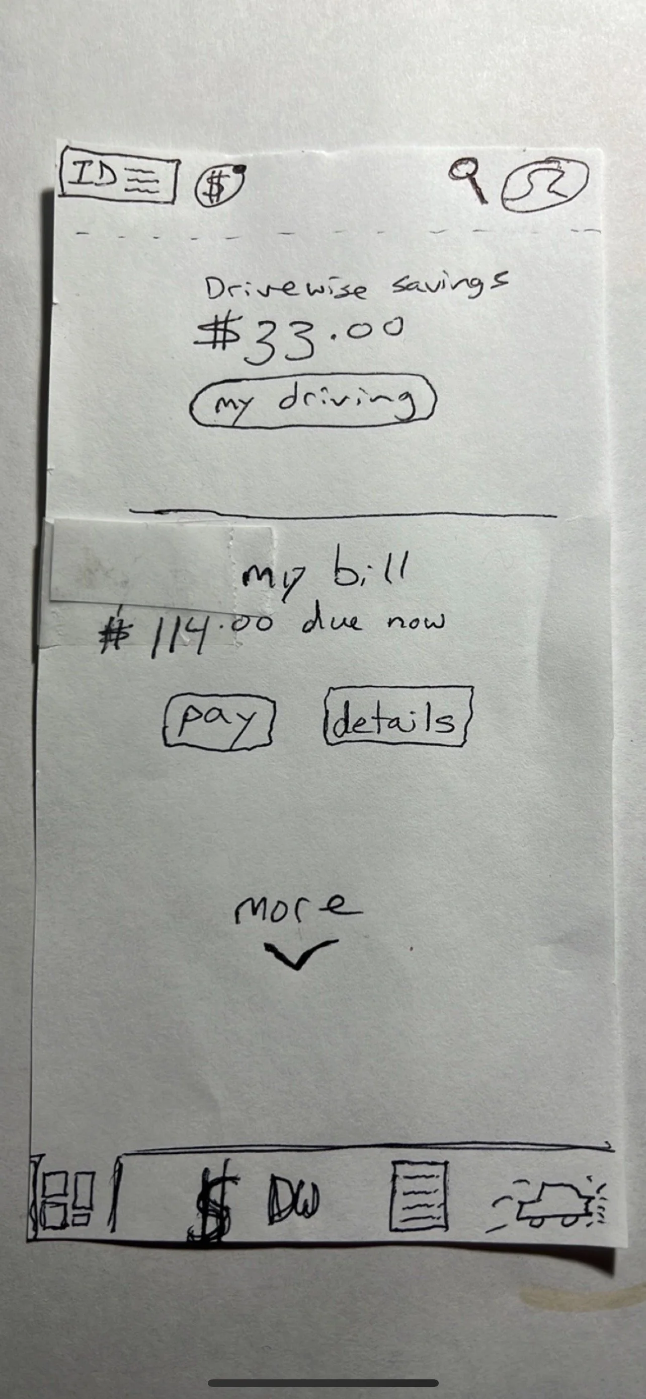
Put on some lo-fi jams and make some low-fi designs
I had to move from idea to low-fi design to hi-fi design in just a few days. So I started with the most basic tool, building a paper prototype and guerrilla testing it with family and people in the Allstate cafeteria. And, no, I did not have my 6 year old do the artwork… although that may have been a better choice.
Regardless! Even the roughest of rough sketches garnered valuable feedback and input to validate and guide the design.


A (slightly) cleaner prototype
If my hand-drawn sketches weren’t enough, I took a stab at the visual design in preparation for sharing the ideas with execs.
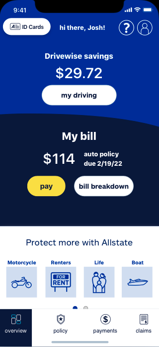
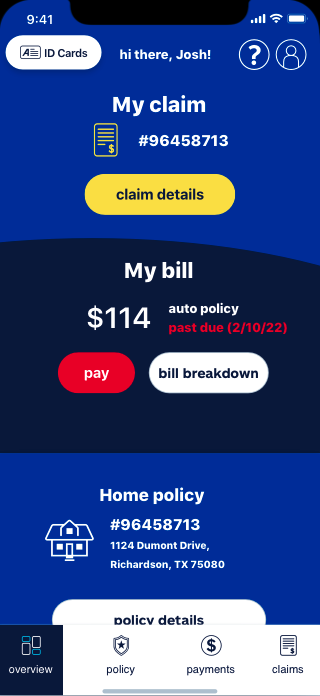
While I won’t be quitting my day job to pursue art, the rough design paired with research and the backing of heuristics made a strong case.
A new navigation for the Allstate app was on the agenda for the next PI 🙌
Cue research montage
Even with buy-in from leadership, we knew my rough research was just a start. I teamed up with our UXR to turn every possible stone with different rounds of research, including:
What our navigation should and shouldn’t include
Card sorting exercises to determine priority
Testing different arrangements and icons
Testing icons with no content to gauge understanding
…and lot’s of other little things.
A clearer navigation
Seeing this go from a collection of small observations in a heuristic review to the roughest-of-rough paper prototypes to a brand new app navigation was encouraging.
I now regularly build in time to check that my own workload isn’t just project fulfillment, but has a healthy foundation of grounded UX thought.